How to Give a Realistic Feel in Photoshop to a 3D Vector Robot
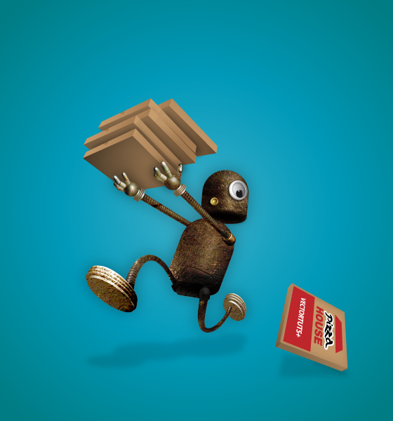
In this tutorial you are going to learn how to combine different methods from Illustrator and Photoshop to enhance your 3D vector art. Through the process you will learn how to use the appearance panel, 3D extrude and 3D revolve. You will also create a custom art brush, and your own symbol. Lets learn how to create masks using Channels and Layers, as well as creating Clipping Masks in Photoshop.
Final Product What You'll Be Creating
Introduction
Working in a professional environment can be tough sometimes. Clients often want to see various sketches of their product, but the final decision is made only when you impress them with an image that is highly polished. This kind of work gives you a rewarding feeling when the client agrees with your concept.
Lets learn some techniques of how to improve your vector 3D art. We’ll use the example of a likable pizza delivery robot that is inspired by Mobot, the robot from the iPad game Monkey Labour, which was released at the end of December 2010.
Step 1
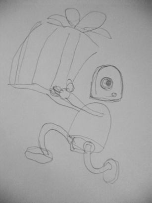
Just because this is a digital tutorial, you shouldn’t expect we’re going to start with Illustrator immediately. A good designer’s practice should always start with your sketchbook. Sketch some ideas and put them on a paper. You don’t have to define everything at once. Designing is a continuing process. This is a rough concept of the art direction with some basics about the feel and dynamics of the picture.
Step 2
Create a new document (I made mine 600px wide by 600px tall). Place the sketch onto your artboard. Double-click “Layer 1″ to get the options popup, and name it “Sketch” for example. It’s better to name layers as you like, that way you can always find the ones you need. Turn on Lock, Dim Images and set it to 50%.
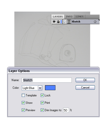
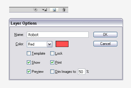
Alt-click the Create New Layer icon in the bottom right corner to get the layer properties popup for the newly created layer, and name it “Robot.”
Step 4
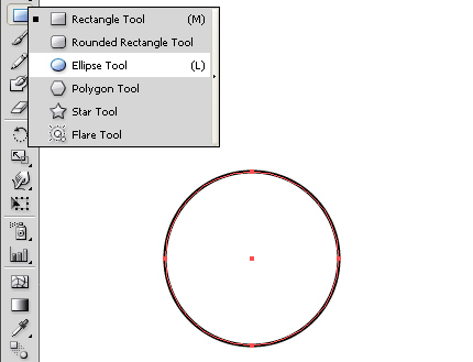
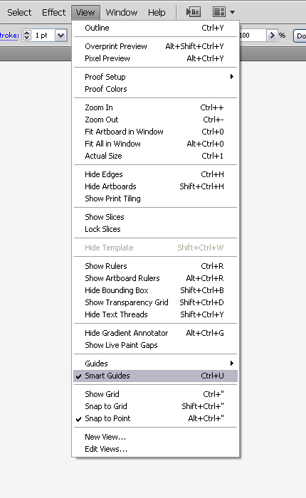
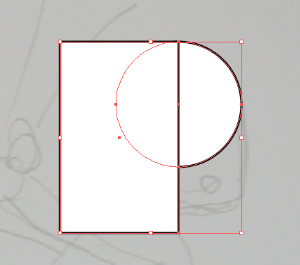
Select the Ellipse Tool (L) and draw a circle. Hold the Shift and Alt keys to constrain the proportions. Turn on the Smart Guides, which you will find under View > Smart Guides or simply click Command + U. This way you will have more control over drawing things that have to be aligned. Create a rectangle with the Rectangle Tool (M), as in the picture below, and make sure the right side of the rectangle is aligned with the center of the circle.
Step 5
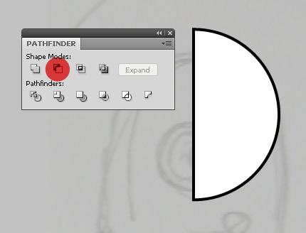
Use the Selection Tool (V) to select both the rectangle and the circle. Now, we want to subtract the rectangle from the circle, so open the Pathfinder Panel and click Minus Front. We’re left with a nice half circle.
Step 6
Create another circle for the chin, and two rectangles. If you forgot to turn on the Smart Guides, now it’s time to do it. It will help you get the desired position, as in the picture below.
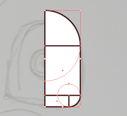
Step 7
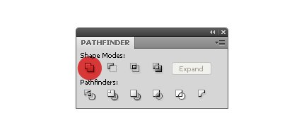
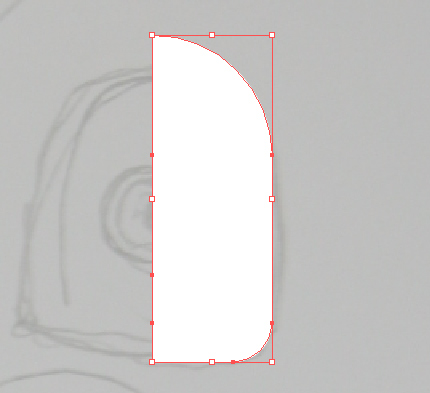
With all the shapes still selected, open the Pathfinder Panel and click Unite to create a Compound Shape. This is our basic-shape to create a robot’s head. To get things proper, it’s good to set the Stroke to zero and Fill to white, that way you have more control over light when you are creating a 3D object.
Step 8
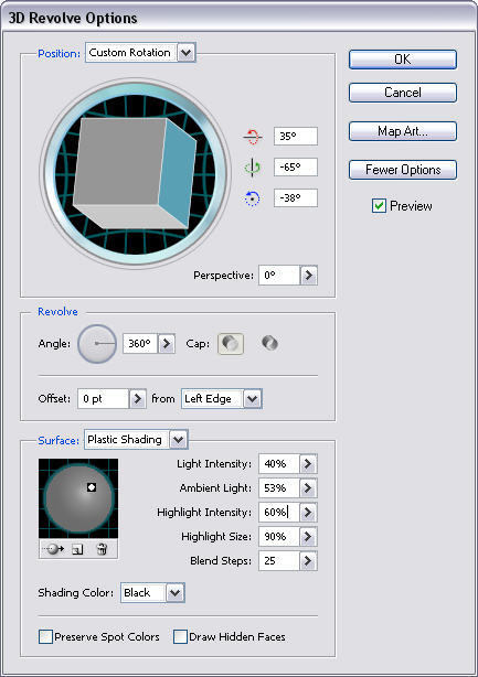
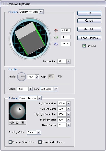
Now, let the fun begin. You are about to create a 3D robot head. With the shape selected go to Effect > 3D > Revolve. Turn on Preview, and click More Options. Apply the following options: 35, -65, and -38. Leave the Perspective at 0 and Revolve options as they are. Adjust Light Intensity to 40%, and Ambient Light to 53%. Click OK, and we have a head.
Step 9
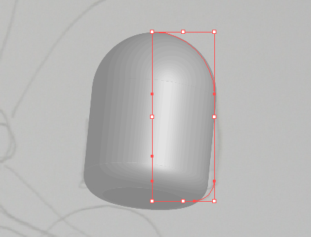
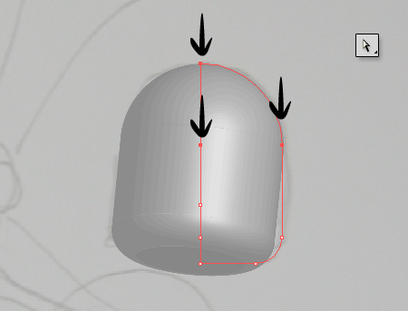
Sometimes when you’re rotating shapes, and you try to find the right angle (especially when you use a perspective other than 0, you see the 3D shape differently than you had planned. Despite the fact that you created a 3D shape, it’s still vector and you can edit it as you like. With the Direct Selection Tool (A) you can select individual or several Anchor Points at the same time, and move them to get a more agreeable shape.
Step 10
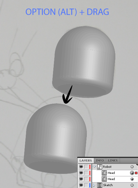
With the Selection Tool (V) you can Alt-drag the Head shape to make a copy of it. Or you can just click the dot on the “Head” layer, and click Command + C + F to copy and paste in front, which is the same. Rename the new layer to “Body.”
Step 11
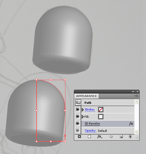
Another cool thing about 3D is that you can always adjust settings later by opening the Appearance Panel. You can change the color of the Fill, Opacity, add a Stroke, or open the 3D options again, and change the options.
Step 12
For now, we are going to reshape the body. Once again select the “Body” shape with the Selection Tool (V), and turn off the visibility of the 3D Revolve Effect in the Appearance Panel. Create the desired shape by moving Anchor Points, and with subtracting a small rectangle from the base shape like we learned before. When you are satisfied with the shape, you can turn on the visibility of the 3D Revolve Effect again.
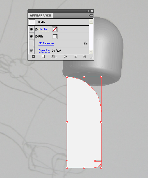
Step 13
Now, let’s move on to some more complex shapes, the hands. As you can see in the picture below it’s nothing new. We can make the base of the hand out of a circle cut in half (name the layer “Base”) and the fingers from the “Head” shape. For that we use the Anchor Point tweaking method, as in Step 9.
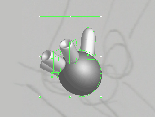
Step 14
When you have many 3D shapes, as in this case, it’s important to know the order of layers. This is so the fingers give you the feeling that they are set in 3D space. You can rotate separate shapes with the interactive cube in the 3D Revolve Options window.
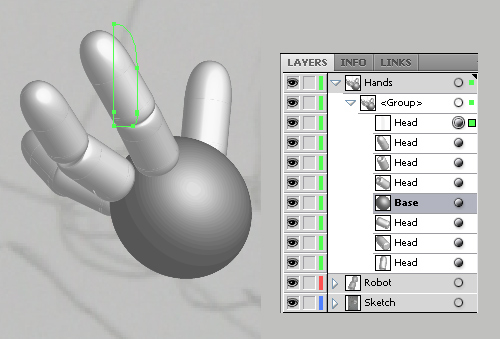
Step 15
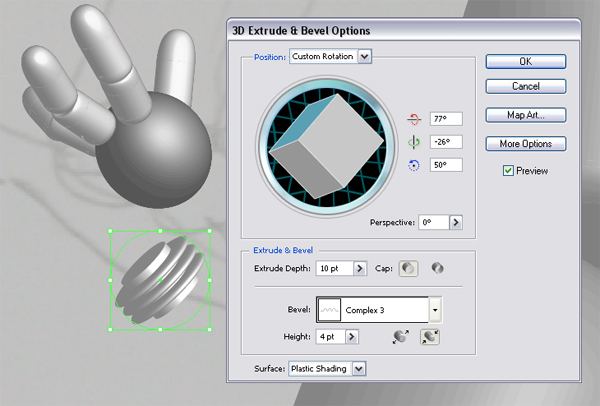
The hand is done. Now we need a wrist. Therefore we are going to learn another 3D method. Create a new circle with the Ellipse Tool (L), and go to Effect > 3D > Extrude & Bevel. Since we are already familiar with the Position section, we shall use the following settings 77, -26, 50, with a Perspective of 0. But we also have a new section where you can choose between different types of Bevels.
We are going to use “Complex 3″ Bevel for our wrist. Set the Extrude Depth to 10 pt, Height to 4 pt, and click OK. Select all the hand shapes, and duplicate them by pressing Command + C + F. Order all the Layers, and name them as you wish. Don’t forget to duplicate the “Wrist,” and put the “Wrist” layer behind the “Base” layer.
Step 16
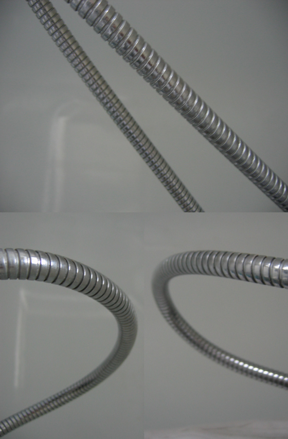
Speaking of the base, we are getting back to basics with this step. We need to connect the hands with the body. Designers need to be resourceful, so you must be aware of things that surround you. Of course, you can go on searching through the web for images that you need, but it’s a lot more fun if you can make everything yourself (like I did). Just grab your camera and take some pictures of a bath hose in different positions, but keep in mind how you are going to use them for the arm and leg positions.
Step 17
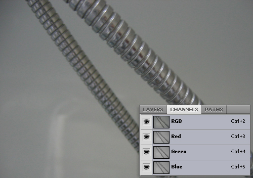
Open one of your new pictures in Photoshop. Let’s start with the one that we are going to use for the front arm. We are going to separate the hose from the background. One way to do this is through the Channels palette. The Channels tab should be by default next to Layers tab, but if it isn’t, you can find it under Window > Channels.
For every RGB image you’ll find three Channels here, one for each color. The Red Channel, Green Channel, Blue Channel, and the RGB Channel which is just a composite of all three. By pressing one of the combinations (Command + 3, Command + 4, Command + 5) written on each Channel, you can isolate a chosen Channel, and all the others become invisible. Try all three, and find the one that has the most contrast between the hose and the background.
Step 18
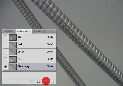
In this case we are going to use the Blue Channel. Drag the Blue Channel to Create a New Channel icon. Now you have created a new channel that we’ll use as an Alpha Channel. Double-click the name of the Blue copy Channel and rename it to “Alpha.”
Step 19
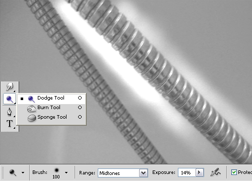
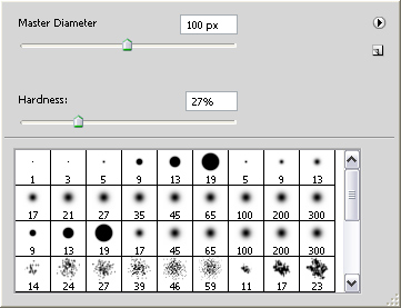
Make sure you are on the Alpha Channel. Pick up the Dodge Tool (O), and in the menu bar select Soft Round 100 pixel brush and set it’s hardness to 27%. In the menu bar’s pull-down you can set Range to both the Dodge Tool (O), and the Burn Tool (O) to Highlight, Midtones or Shadows.
The Burn Tool (O) darkens the area, and the Dodge Tool (O) lightens it up so therefore you should use “Shadows” for the Burn Tool (O) if you don’t want to darken the light areas. You can also adjust the intensity with the Exposure setting. When using the Dodge Tool (O) start with the Midtones Range setting and lower Exposures around 10 – 20%, though it depends of the image. Then you can continue with the Highlights setting and 15% Exposure.
Step 20
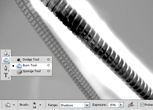
Set the Burn Tool (O) to Shadows and Exposure to 25%, then start burning the dark areas. You can quickly access the brush setting with right-click. Make sure to make adjustments according to your image. You’ll need to change between the Burn and Dodge tools several times, as well as adjust your brush size, and exposure settings. But don’t be afraid. By the end of last image you’ll get the hang of it.
Step 21
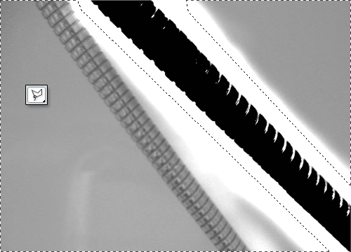
When you seem to be at the end you can help yourself with the Lasso Tool (L). Select the remaining areas and fill them with a white color by pressing Command + Backspace to fill the area with the Background color. If you have set any other color instead of white and black, press D to reset the colors. Use the Brush Tool (B) to color the remaining areas that couldn’t be burned to black.
Step 22
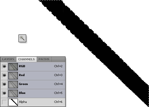
With the Magic Wand Tool (W) select the black area, and click on the RGB Channel to select all the Channels except the Alpha Channel. Go to the Layers Palette, right-click the image and select Layer via Copy or press Command + J to create a cut-out layer with only the hose on it.
Step 23
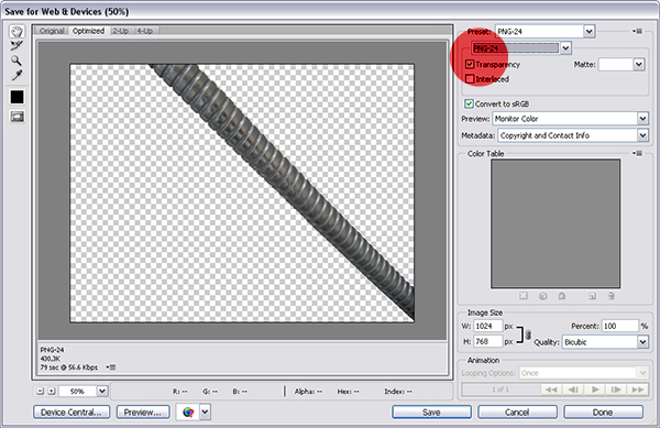
Turn off the “Background” layer and save your image as a transparent PNG-24.
Step 24
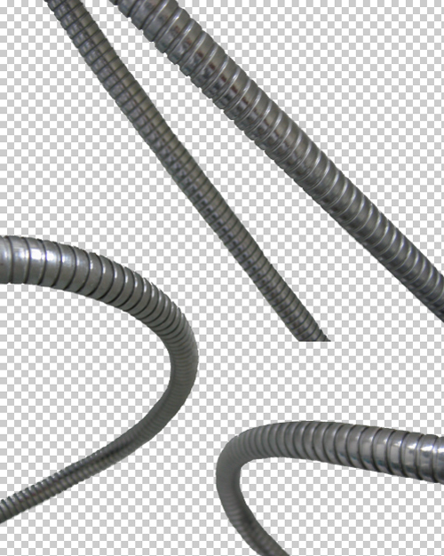
Repeat the steps in Photoshop for all the other images to get another arm and two legs.
Step 25
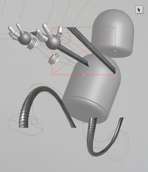
Once back in Illustrator you can position arms and legs into the correct place, and scale them down accordingly using the Selection Tool (V). Use the rough Sketch image as a reference for positioning the arms and legs, but you don’t have to stick by it. Designing is always a process in the making, and most of the time results are even better if you experiment a little.
Step 26
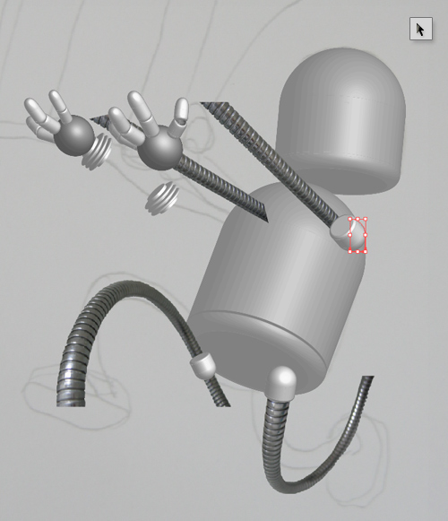
But how are we going to stick the arms and legs into his body? We can use the “Head” for the shoulder and hip joints. With the Selection Tool (V) Alt-drag the “Head” to duplicate it. Make three copies of it. Scale them down and adjust the perspective using 3D Revolve in the Appearance Panel, as we did before. Use the following Position settings for the shoulder: 141, 3, and 38. For the front hip joint: -52, 60, and -56, and for the back hip joint: 15, -21, and -159.
Step 27
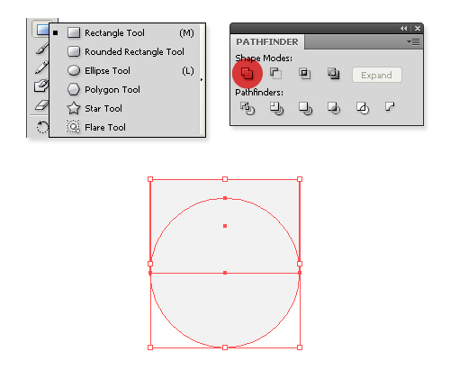
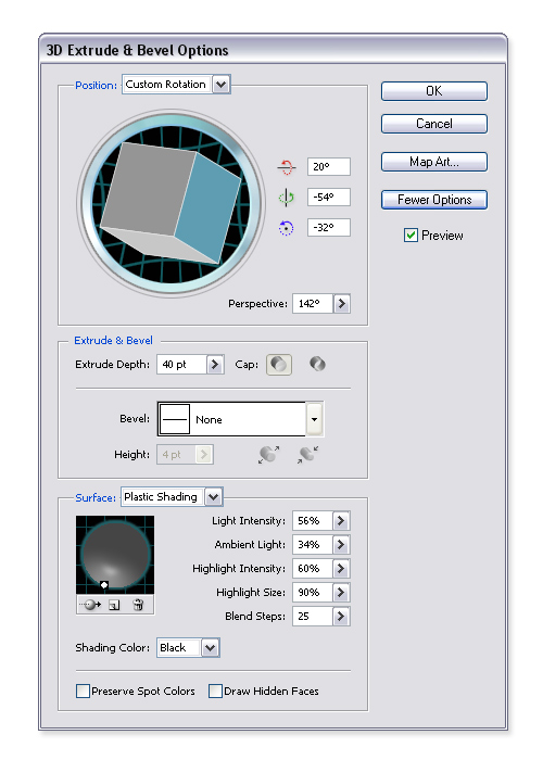
To make a hip that connects the hip joints, create a circle with the Ellipse Tool (L), and a rectangle with the Rectangle Tool (M). Merge them with Unite Tool in the Pathfinder Panel. Go to Effects > 3D > Extrude & Bevel, and fill in the following settings for Position: 20, -54, -32. Set Perspective to 142, Extrude Depth to 40 pt, and apply the following settings for Surface: 56, 34, 60, 90, 25.
Step 28
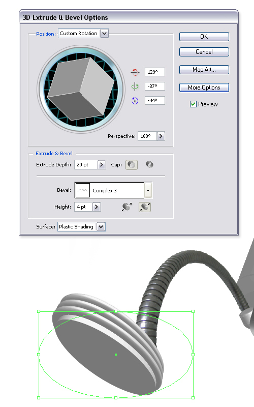
To make the robot complete, it needs a pair of feet. With the Ellipse Tool (L) create an Ellipse and go to Effects > 3D > Extrude & Bevel. Set Position to: 129, -37, -44, Perspective to 160, Extrude Depth to 20 pt, Height to 4 pt and for Bevel choose “Complex 3.” Hit OK, duplicate the shape and rename both to “Right” and “Left Foot.” For the left foot apply the following settings: Position 151, -52, -71; Perspective 160; Extrude Depth 20 pt, Height 4 pt, and once again choose “Complex 3″ for the Bevel.
Step 29
Now let’s learn something new for a change. As you can see arms and feet don’t exactly fit into joints. We’re going to correct this by using Clipping Masks. Let’s start with the robot’s left foot. If we use perspective correctly, then his left leg seems a bit longer. So let’s put his left foot where we think it should be.
Pick up the Pen Tool (P) and draw a shape that surrounds the part of the leg we want to be visible. Select both the shape and the leg (shape has to be in front of the leg!), right-click the mouse and select Make Clipping Mask. Voila, we cut the leg off. Now do the same with everything that needs to be cut off.
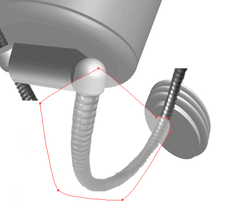
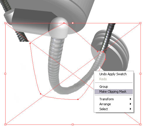
Step 30
If you cut off all the extremities and put all the layers in the correct order so the shapes don’t overlap each other, you should have something that looks like the image below by now.
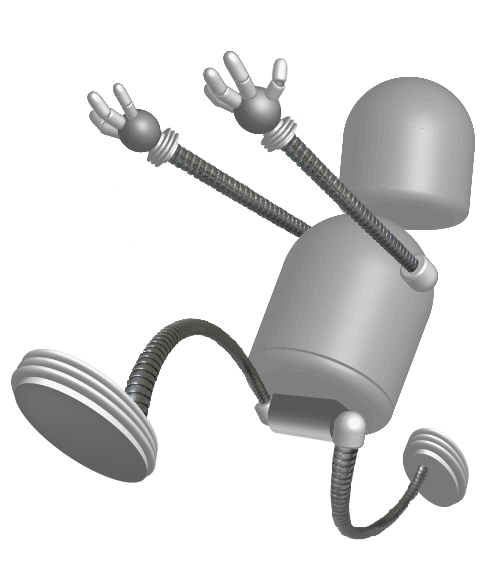
Step 31
Select all and press Command + C to copy the robot to the clipboard. Return to Photoshop and press Command + N to create a new document. The default size of the image will be the same size as the robot, but you can make it bigger because we will need a little more space to manipulate the image. Make it 1600 by 1200 pixels with a 180 resolution and name it Mobot.
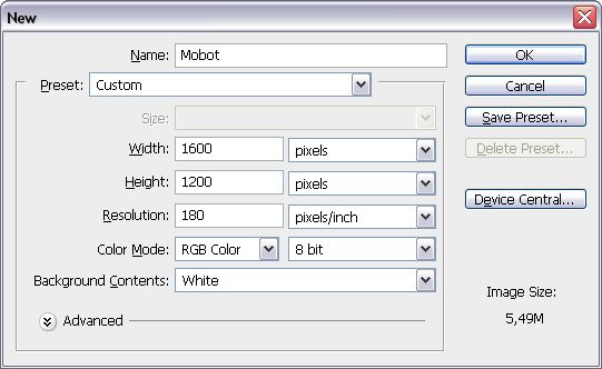
Step 32
Press Command + V to paste the content. Choose Paste as: Smart Object, click OK, then Return to confirm it. Rename the Vector Smart Object layer to “Mobot.” Go to File > Place, and choose a file for your texture, click Place and hit Enter. You can also delete the “Background” layer as we won’t need it.
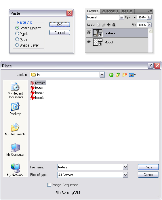
Step 33
Make sure the “texture” layer is above the “Mobot” layer. Right–click it and choose Create Clipping Mask. You’ll get something similar that shown below.
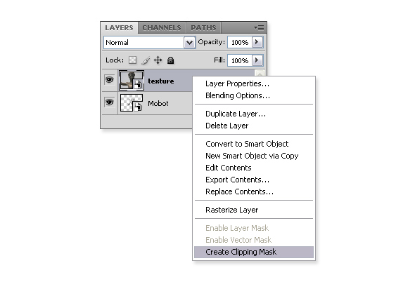
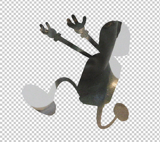
Step 34
After you created a Clipping Mask, you can now freely move the texture layer (with the Move Tool), and still keep the outline of the robot. In the Layers Palette set the Blending Mode to Linear Light, and the Opacity to 97%.
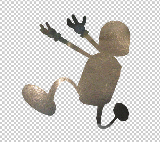
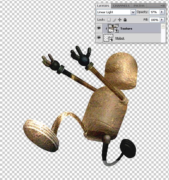
Step 35
The texture is uneven, and we want to get proper results, we can’t use one texture for all parts of the robot. That’s why we are going to learn another method of masking. Make sure you have selected the “Texture” layer. Click on the Mask tool. Your “Texture” layer will get the Mask Thumbnail. By default the mask Thumbnail is locked to the Layer Thumbnail, and for the purpose of this tutorial we’ll leave it at that, but keep in mind that you can unlock the Thumbnails and move the layer and it’s Mask separately if you want to.
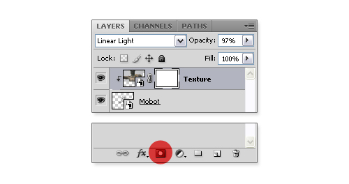
Step 36
Knowing that the layer and its mask are separate entities, you can choose either one of them to make corrections on it. Now we need to mask the layer so we’ll click on the Mask Thumbnail (if it’s not already chosen). Pick up the Brush Tool (B), and paint the legs and arms with a black color. By doing that you are setting an Alpha Channel that tells you the parts that are visible and those that are not. If you compare your painting with the Mask Thumbnail you can see the parts that are painted black are not visible.
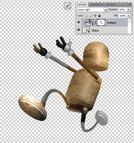
Step 37
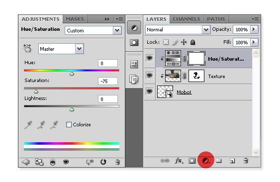
When you are fairly finished, you can add an Adjustment layer over it. Click the small black and white circle at the bottom and choose Hue/Saturation, the Adjustments Palette should open by default. If it isn’t, then you can find it under Window > Adjustments. Set the Saturation to -75 and create a Clipping Mask on the Hue/Saturation Adjustment layer.
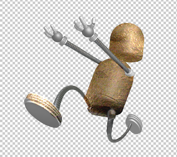

Step 38
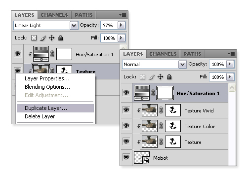
To duplicate the “Texture” layer simply click it and press Command + J, or right-click it and select Duplicate Layer. Name it “Texture Color,” and set its Blending Mode to Color Burn, and the Opacity to 14%. Make another copy of the layer, and name it “Texture Vivid.” Set the Blending Mode of this one to Vivid Light, and adjust the Opacity to 60%.
Step 39
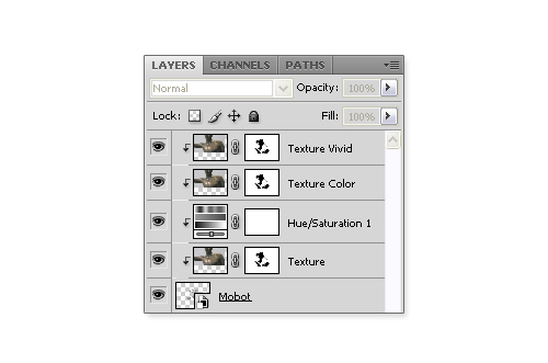
To get the results right, drag the Hue/Saturation Adjustment layer between the “Texture,” and “Texture Color” layers. This way the Adjustment layer will influence only the “Texture” layer.
Step 40
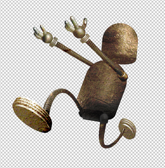
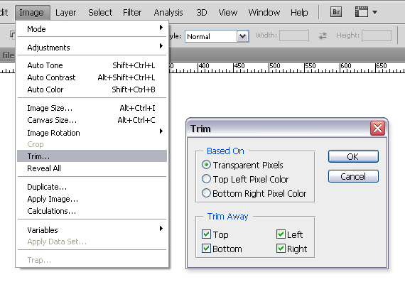
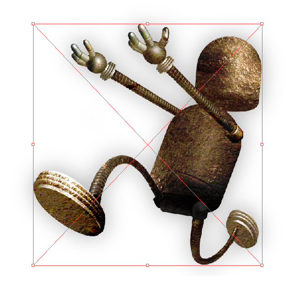
Now apply the knowledge gathered from steps 33 to 39 to make the texture layers for the legs and arms. The character at this point should be similar to the one below. Save the file as a PSD. Go to Image > Trim, select Transparent Pixels, and click OK. Save the image as a transparent PNG-24, and place it in your Illustrator file.
Step 41
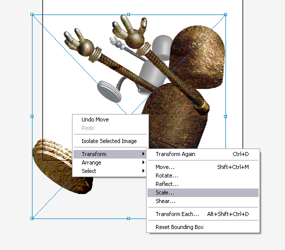
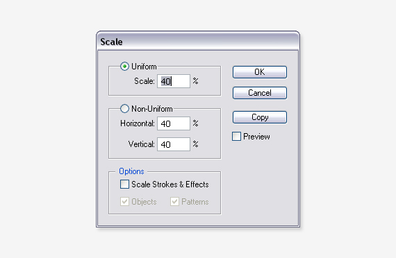
Once back in Illustrator you will probably notice that the imported image is a bit bigger than the vector robot. That is because we worked in 180 ppi Resolution in Photoshop, while default Resolution in Illustrator is 72. So if you calculate, you get that 72 at 40% of 180. Right-click on the imported image, and select Transform > Scale. Set 40% to Uniform Scale, and click OK.
Step 42
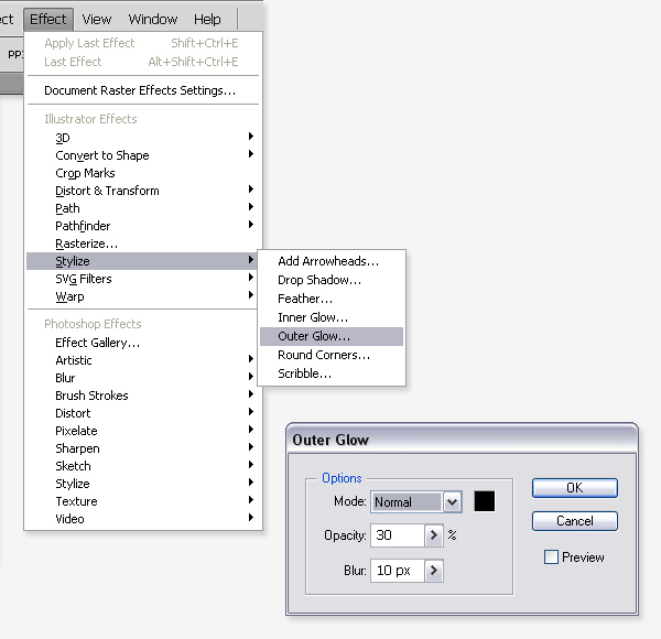
Select the transformed image, place it over the vector robot, and put it into a separate layer. Name the layer “Mobot,” and while still selected go to Effect > Stylize > Outer Glow. Apply a Normal Blending Mode with black color, 30% opacity and 10px Blur.
Step 43
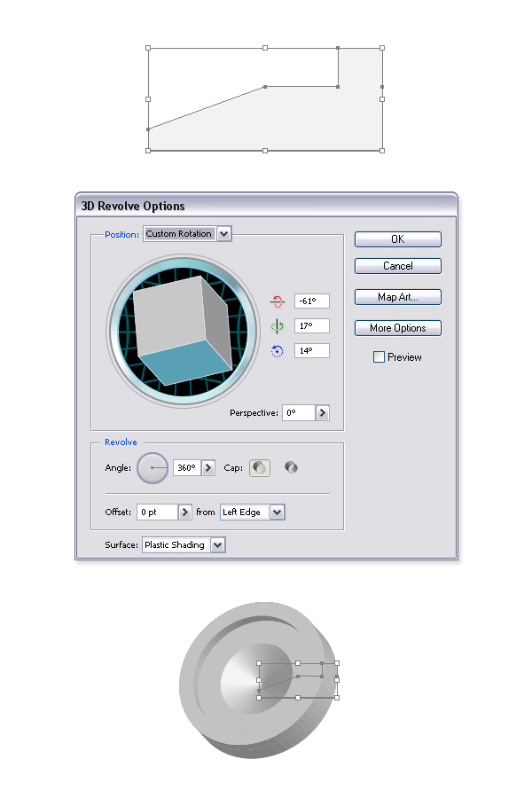
Create a new layer, name it “Face,” and hide all the other layers. Pick up the Pen Tool (P), and make a shape like the picture below. Go to Effects > 3D > Revolve, and apply the following settings: Position -61, 17, 14. Leave the rest, and make sure you have selected Left Edge for Offset. Name the shape “Mouth,” and make a copy of it (Command + C + F).
Step 44
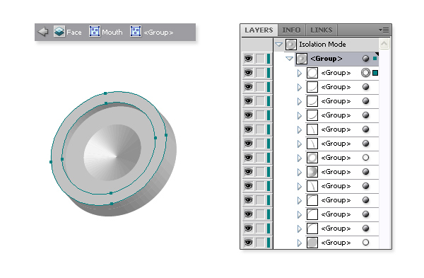
While still having it selected go to Object > Expand Appearance… with the Selection Tool (V) double-click on the “Mouth” object twice to get into Isolation mode. Hold the Command key and select all the layers you don’t need. Delete them by clicking the small thrash icon.
Step 45
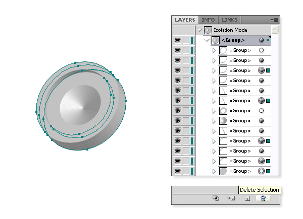
Once again use the Selection Tool (V), hold down the Shift key, and select groups like in the picture below. Open the Pathfinder Panel, and click Unite to join them into one shape. Select this new shape, and add a nice gray to white gradient using the Gradient Tool (G).
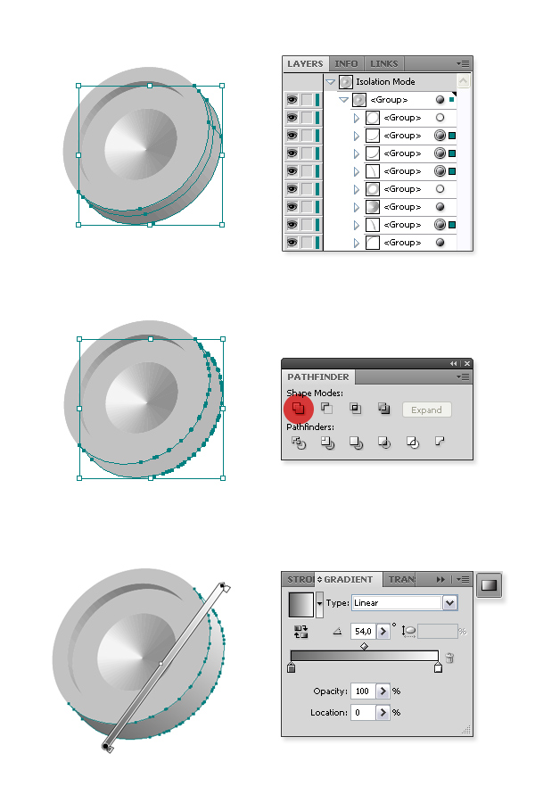
Step 46
Give all the other shapes gradients like shown in the pictures below. Once you are finished, double-click somewhere blank on the Artboard to return from Isolation mode.
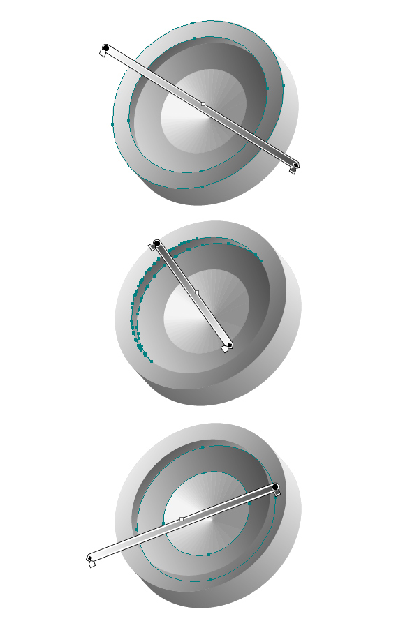
Step 47
Hide the “Mouth” layer you have been just working on, and select original Mouth object (before you made a copy of it), then go to Object > Expand Appearance. Now click the Unite Tool from the Pathfinder Panel. You will get a quite simple shape with many Anchor Points. To get rid of them go to Object > Path > Simplify, set the Curve Precision to 100, Angle Threshold to 0, and click OK.
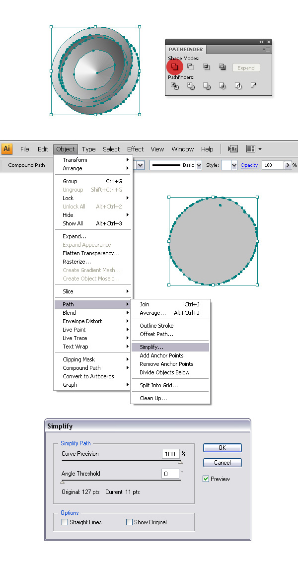
Step 48
Let’s add a nice color #FBB03B to this shape, and some shadow. For setting a shadow go to Effects > Stylize > Drop Shadow, and apply the following settings: Mode of Multiply, 100% Opacity, X Offset at -2px, Y Offset at 2px, and 1px Blur.
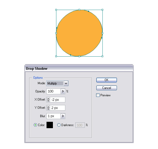
Step 49
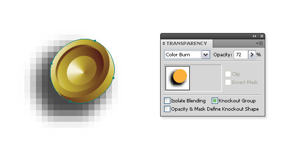
Once you are finished rename this layer to “Mouth Color,” and put it in front of the “Mouth” layer (you can make it visible again). Open the Transparency Palette, and set the Blending mode to Color Burn, and Opacity to 72%.
Step 50
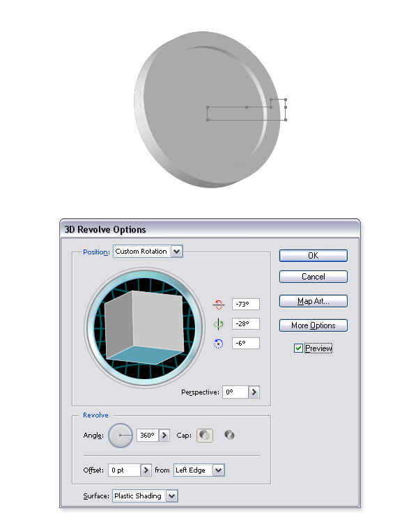
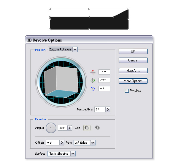
Now let’s create the eye, using the same method as before. With the Pen Tool (P) make a shape like in the picture below, and create a 3D Revolve with the following settings: -73, -28, -6 for position. Leave everything else as it is.
Step 51
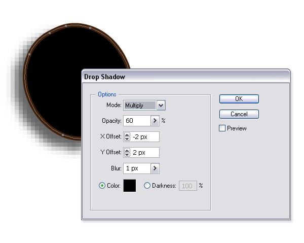
Once again, go to Object > Expand Appearance, and duplicate the layer. Select the shape on the bottom “Eye” layer, again use the Unite Tool on the Pathfinder Panel, and Simplify the Path as in Step 47. Give it a nice brown #42210B stroke of 1px, and Drop Shadow with the following settings: Multiply, 60%, -2px, 2px, 1px, black color. Rename the Path to “Eye Shadow.”
Step 52
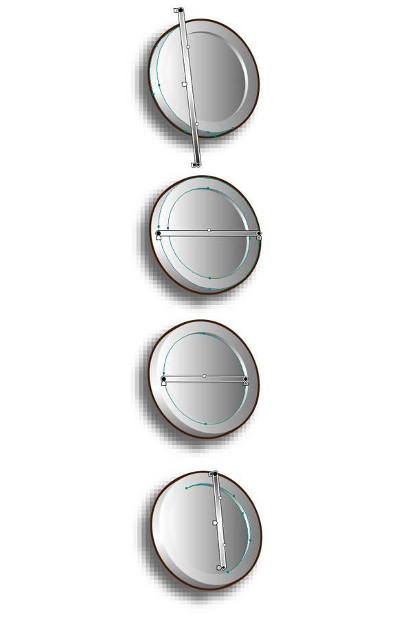
Select the Group on the “Eye” layer, and use the same method as in Steps 44 and 45 to get something like in the pictures below.
Step 53
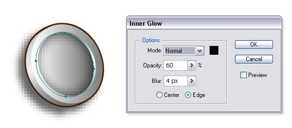
With Direct Selection Tool (A) select the ellipse in the middle, and go to Effect > Stylize > Inner Glow. Apply the Normal Blending Mode with a black color, 60% Opacity, and a 4px Blur.
Step 54
To add the Iris of an eye, create a shape shown below. Give it the following 3D Revolve Options: -73, -28, -6.
Step 55
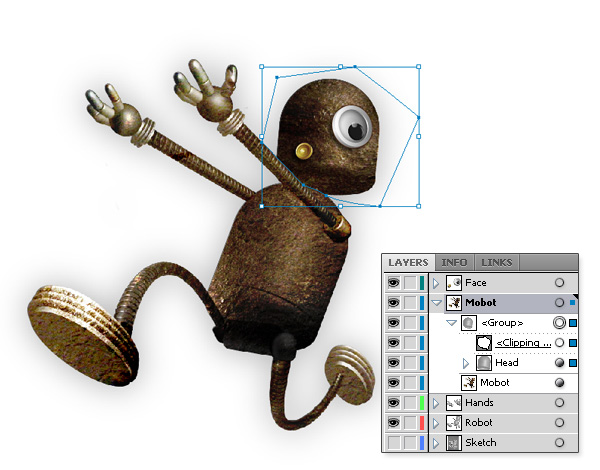
Now unhide all the layers, and pose the “Mouth” and the “Eye” in the right place. Duplicate the “Head” layer, and put it in the front of a “Mobot” layer. As you can see the head is looking over the left arm so let’s create a shape with Pen Tool (P) like in the picture, and make a Clipping Mask.
Step 56
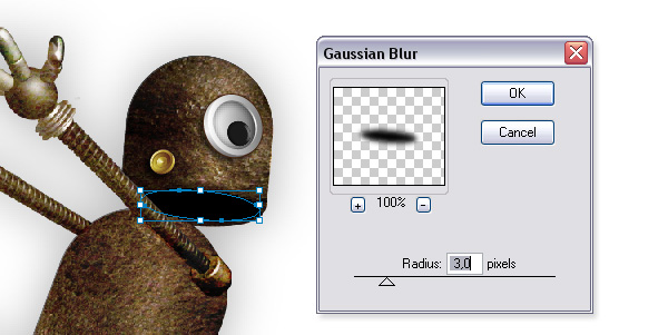
With the Ellipse Tool (L) create a black ellipse, and go to Effects > Blur > Gaussian Blur. Give it a 3,0px Radius, and hit OK. To hide the part that’s looking over the arm, make a Clipping Path like in the previous step. Voila, Mobot is finished!
Step 57
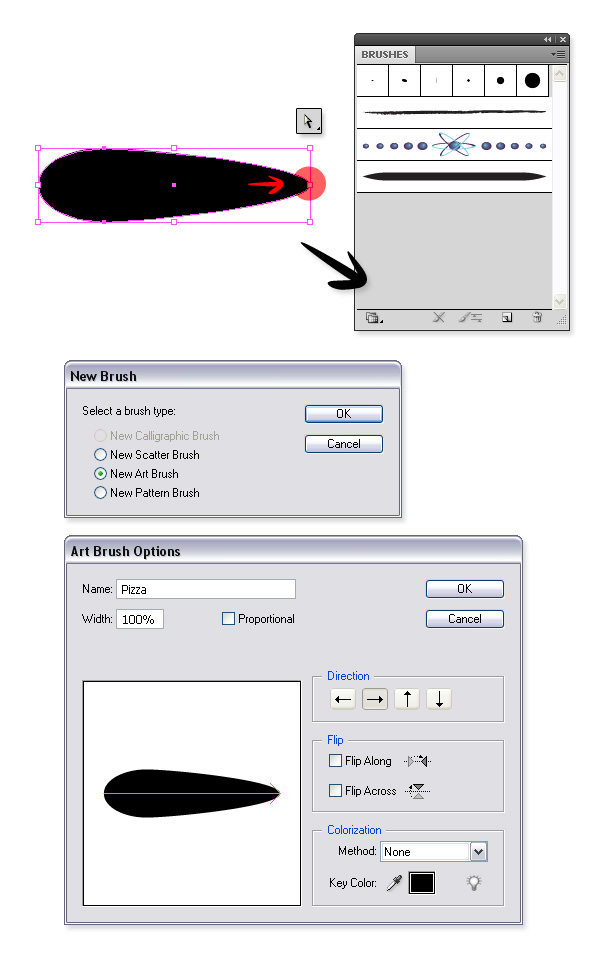
Now let’s create a Pizza logo for the boxes. Make a new layer “Pizza Symbol,” and draw an ellipse with the Ellipse Tool (L). Pick up the Direct Selection Tool (A), and drag the right anchor further to the right to get something similar to the picture. Drag the shape to the Brushes Palette. Select New Art Brush, and click OK. In the Art Brush Options apply the Name “Pizza,” leave everything else as it is, and hit OK. You have created your own brush!
Step 58
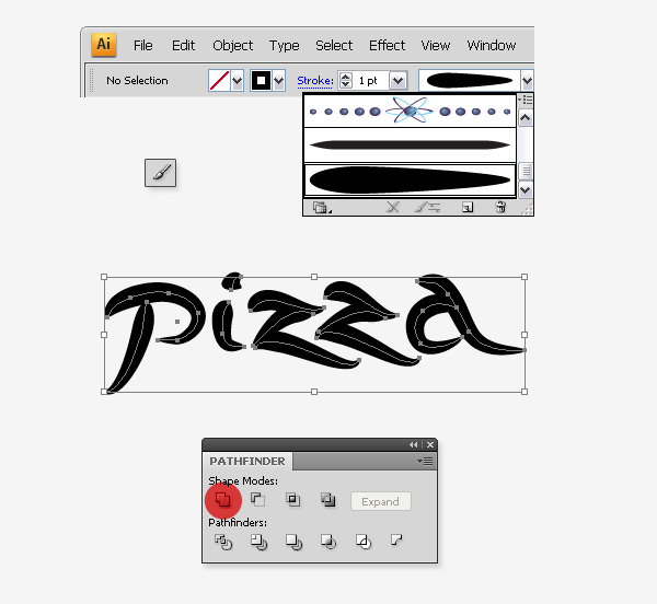
Pick up the Paintbrush Tool (B), and choose your “Pizza” brush in the menu bar. Draw the letters to spell “Pizza.” Select them all, and press Command + G to group them. Expand the Appearance of the group to prevent resizing of the stroke when scaling. Join the shapes with the Unite button on the Pathfinder Panel.
Step 59
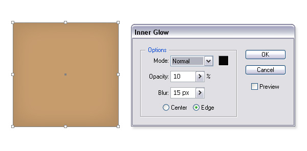
Draw a rectangle 100px wide by 100px tall, and give it the color #C69C6D. Go to Effect > Stylize > Inner Glow, and give it the following settings: Normal, 10, and 15px.
Step 60
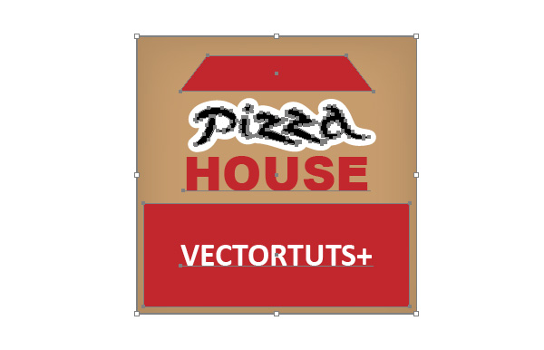
Put your Pizza sign over the rectangle, and give it a nice white stroke. Add some rectangles, and words to make it more interesting. For the roof and fonts I have used a red (#C1272D) color.
Step 61
Draw a rectangle the same size as the one you have been using in step 59, and give it light gray color (#F2F2F2). Scale it up to 200%. Go to Effect > Texture > Texturizer. In the dialog window change the Texture to Canvas, the Scaling to 120, and relief to 30. Hit OK.
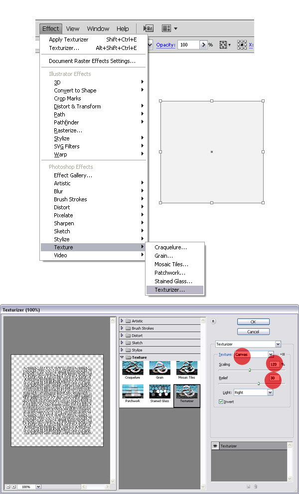
Step 62
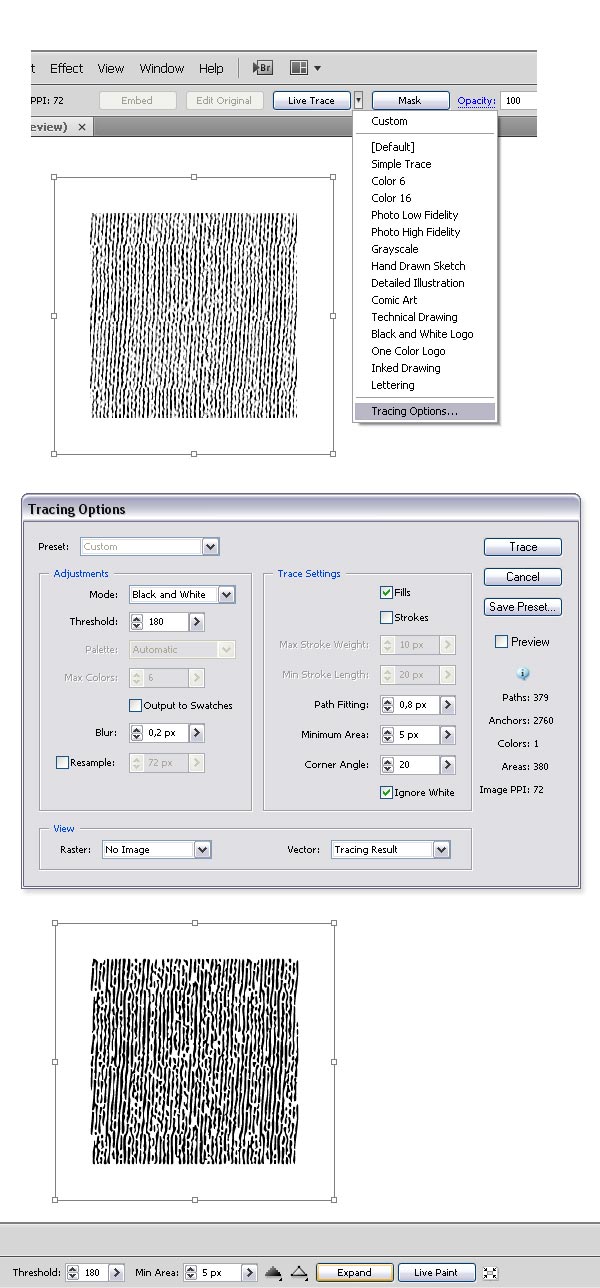
Go to Object > Expand Appearance to expand the texture. In the menu bar click on a triangle next to the Live Trace button, and choose Tracing Options. Apply the following settings: Threshold 180, Blur: 0,2px, Fills, Path Fitting: 0,8px, Minimum Area: 5px, Corner Angle: 20, and Ignore White. Hit Trace after you’re finished inputting the values. In the menu bar find the Expand button, and click it.
Step 63
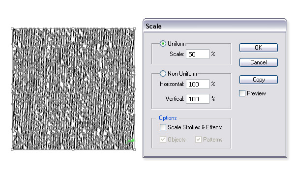
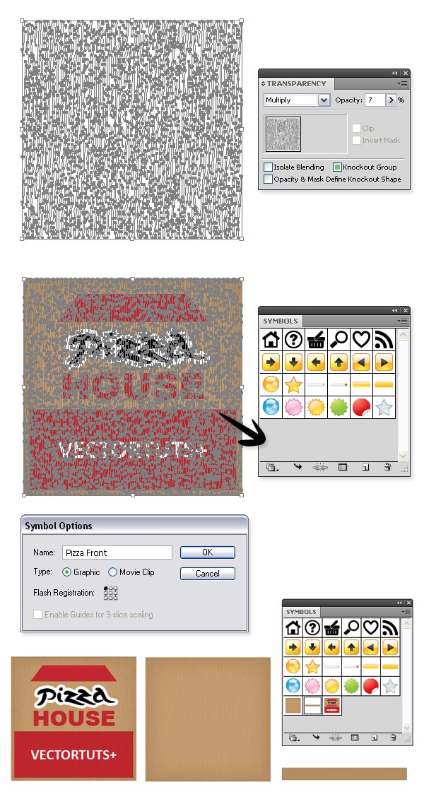
Scale back the rectangle to its previous size. This time you have to use 50% in the transform dialog box. Give it the color #957552. Open the Transparency Panel, set the Blending mode to Multiply, and the Opacity to 7%. Select all, and drag it to the Symbols Palette. Name the symbol “Pizza front,” select the Graphic, and click OK. Use the same method for creating the “Pizza back,” and “Pizza side” symbols.
Step 64
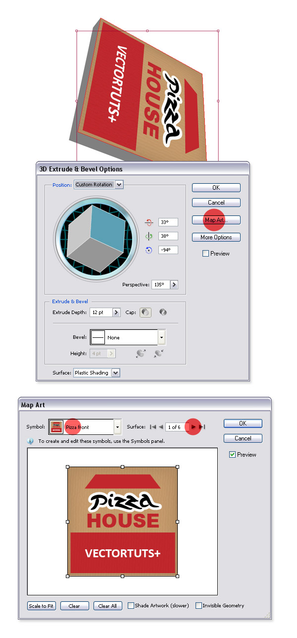
Draw a Rectangle 100px by 100px using the Rectangle Tool (M), and create a 3D Extrude (Effects > 3D > Extrude, and Bevel) with the following settings: Position: 33, 38, -94, Perspective: 135, Extrude Depth: 12pt. Click Map Art, and select the “Pizza front” symbol, which you created before in the Symbol drop down menu. Click the small triangle to walk through the other sides of the box. For the third and fourth side of the box choose the “Pizza side” symbol. Click OK to confirm the Map Art, and again for the 3D Extrude settings.
Step 65
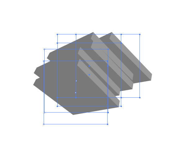
Draw some more rectangles the same size for making new Pizza boxes using the 3D Extrude and Bevel, as in the picture below.
Step 66
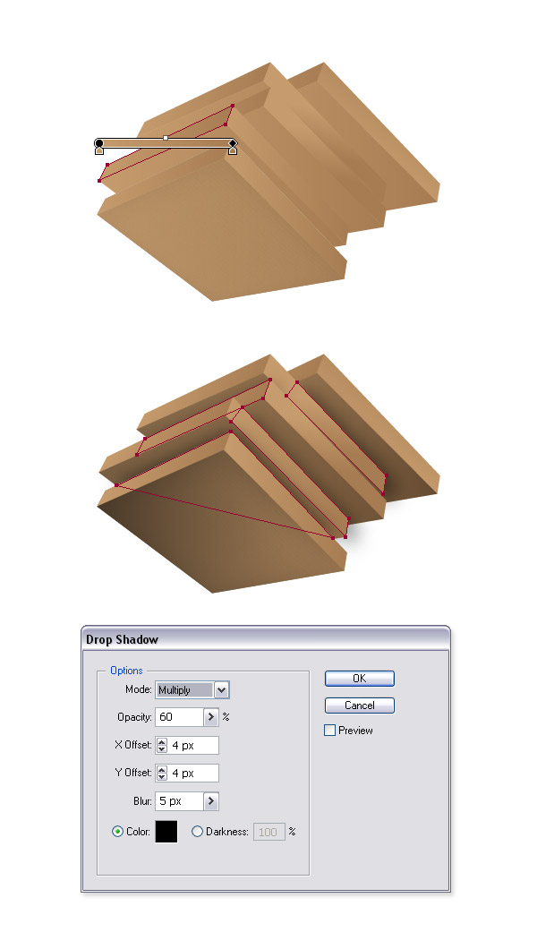
If you want some more details you can expand each box (find it under Object > Expand Appearance), delete the needles layers and experiment with different gradients. For mine I have used the colors #C69C6D and #A67C52. Create some shadows, and add a background of your liking. And we’re done.
Conclusion
I hope you have enjoyed this tutorial and learned some new techniques. Have fun until the next time.


0 comments:
Post a Comment
Your precious comments/critics will help this site improve